

Information
Frozen. Surgical. Monolith.
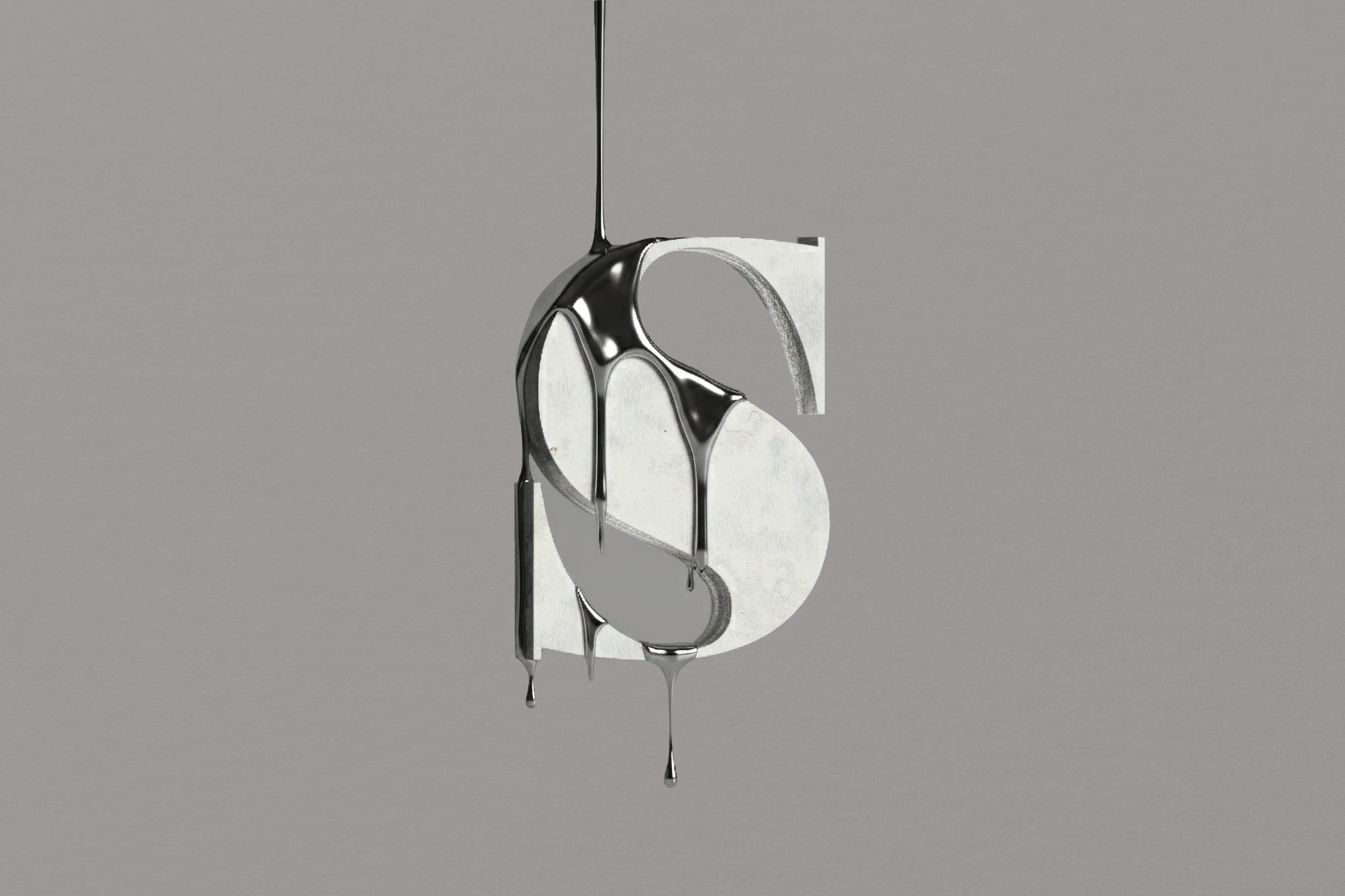
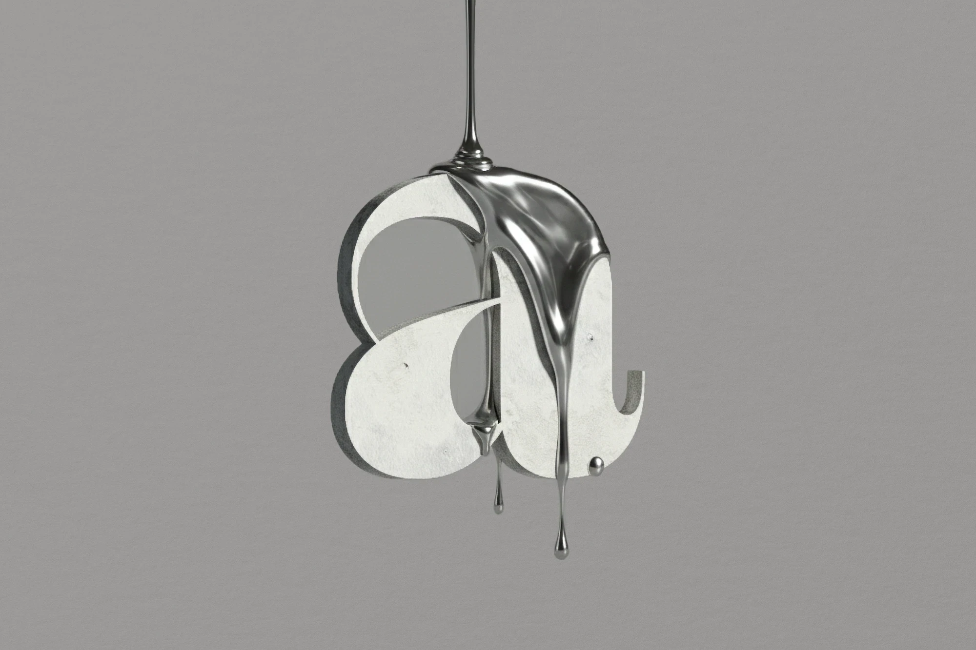
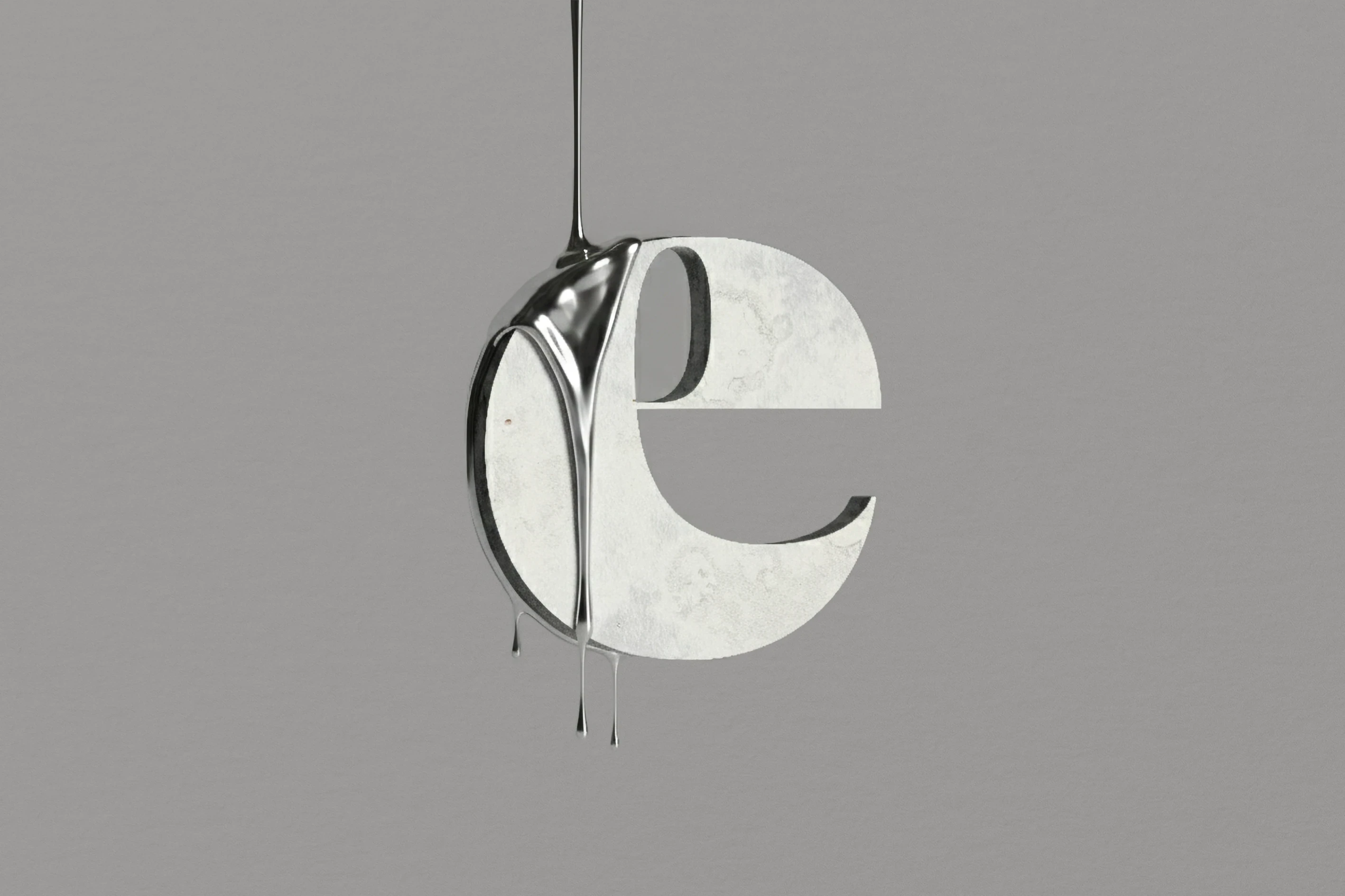
Zermatt is a serif defined by precision, restraint, and high-end editorial discipline.
It seeks a fine balance between liquid shapes and sharp tension. It does not aim to lead, but to watch the moment where molten metal meets a sharp edge. It is an honest search for form, accepting its own energy as a natural part of the design.
Zermatt stays a modest base for any message. It chooses sharp curves over loud effects. It is built for those who value a real, tactile feel and avoid unnecessary detail.
Family
(
14
)
Details
Typeface
Zermatt
Version
031 - Jan 2026
Cut
14
Release
2019
Glyphs
512
Classification
Display Serif
Design
Muhittin Güneş
Supported Languages
Open
Supported Languages
Open
This section is currently unavailable on mobile.
For type testing and full glyph access, we recommend viewing this page on a desktop or tablet.
Previews
Etymologists
Enthronement
Wellrounded
Blamelessness
Purposefully
Receptiveness
Disembowel
Devaluations
Dissertation
Inexpressibly
Telephonist
Homeowners
Blubbering
Italicisation
Studio Muhittin Güneş ©
2019
-
2026